Volusion website redesign

Volusion Website Redesign:
USFlagStore.com

U.S. Flag Store sells American-made flags from Kansas City, Missouri, with a manufacturer behind it that has been in business since 1951. We started with a digital roadmap, then redesigned its Volusion store around that promise: a home page, a category page, and a product page that work on every screen.

3
Templates: home, category, product
4
Promises repeated on every page
1
Layout for desktop and phone
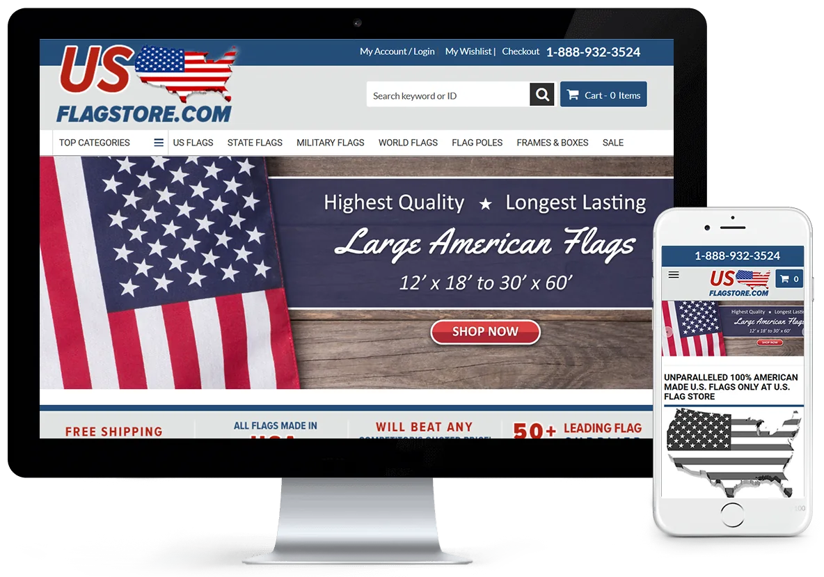
The redesigned USFlagStore.com Volusion store on a desktop monitor and a phone: the US Flagstore.com logo, a phone number, a search box, a menu from US Flags to Frames and Boxes, and a banner reading Highest Quality, Longest Lasting, Large American Flags
Client
USFlagStore.com (U.S. Flag Store)
Location
Kansas City, Missouri
Business
American-made U.S., state, military, and world flags, flagpoles, display cases, and frames
Platform
Volusion
Work
Digital roadmap, redesign of the home, category, and product pages, responsive layout, custom Volusion development

The screenshots on this page show the Volusion store as we designed it. The store has since been rebuilt with a headless front end and a newer design; see the headless build.

Published . Updated .

The challenge

A Flag Store Sells on Trust, and Trust Has to Show

USFlagStore.com sells flags made in the United States: U.S., state, military, and historical flags, with flagpoles, display cases, and frames beside them. It is based in Kansas City, Missouri. The manufacturer behind it, Allied, has been in business since 1951 and describes itself as one of the largest suppliers of flags to the United States Government.

A shopper deciding where to buy a flag asks a few plain questions. Where is it made? How long will it last? What if another store quotes less? The redesign had to answer those before the shopper went looking, on the first screen of every page.

It also had to work on a phone. Google began using mobile-friendliness as a ranking signal for mobile searches on April 21, 2015, and a store that did not adapt to a small screen was giving up ground in search. And it had to be done on Volusion, where the platform produces the category and product pages itself inside one store template. A redesign there is template, CSS, and script work, which is what our Volusion web design team does.

What we did

Strategy, Design, and Custom Development

A plan first, then the three templates every flag is sold through, then the development that made them work on every screen.

  1. A Digital Roadmap Before Any Design
  2. A Home Page That Leads With the Promise
  3. Category Pages That Explain the Choice
  4. A Product Page With Nothing in the Way
  5. One Layout for Every Screen, on Volusion
  6. What Came Next: The Same Structure on a New Platform

Strategy

A Digital Roadmap Before Any Design

We started with an in-depth digital roadmap. It defined the goals for the site and took us through USFlagStore.com's site infrastructure, its content, its analytics, and its current and past marketing.

A roadmap is where a redesign gets its priorities: what the home page should lead with, which templates carry the most sales, and what the store already does well and should keep. Design decisions made after that step can be explained. Design decisions made without it are taste.

It draws on the same work as our eCommerce UX and Volusion SEO services.

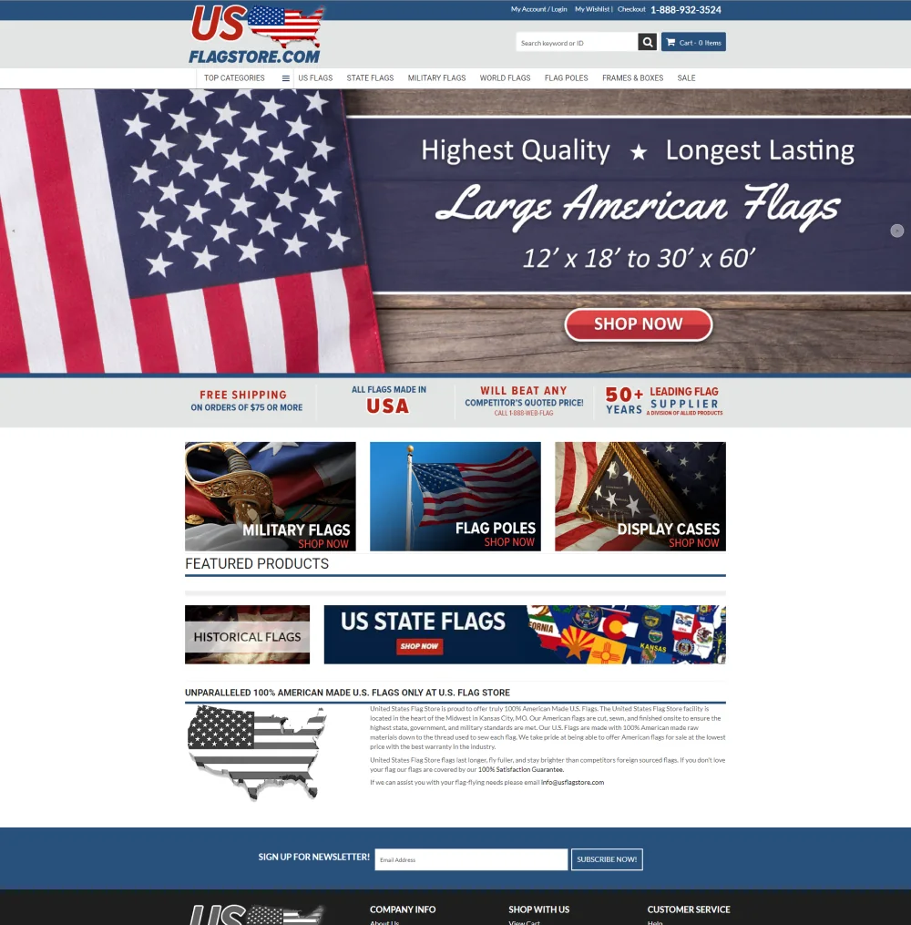
USFlagStore.com home page on Volusion: the logo and phone number, a department menu, a Large American Flags banner, four promises (free shipping on orders of $75 or more, all flags made in USA, will beat any competitor's quoted price, 50+ years leading flag supplier), tiles for military flags, flag poles, and display cases, featured products, and a newsletter sign-up
The home page.

Design · Home page

A Home Page That Leads With the Promise

The header puts the phone number, the account links, a search box that takes a keyword or a product ID, and the cart on one line. The menu names the departments: U.S. flags, state flags, military flags, world flags, flagpoles, frames and boxes, and sale items.

Under the banner sit four promises, side by side: free shipping on orders of $75 or more, all flags made in the USA, a commitment to beat any competitor's quoted price, and more than 50 years as a leading flag supplier. They repeat on every page of the store.

Below them, three tiles open the largest departments (military flags, flagpoles, and display cases), followed by featured products, state and historical flags, and a short account of where and how the flags are made.


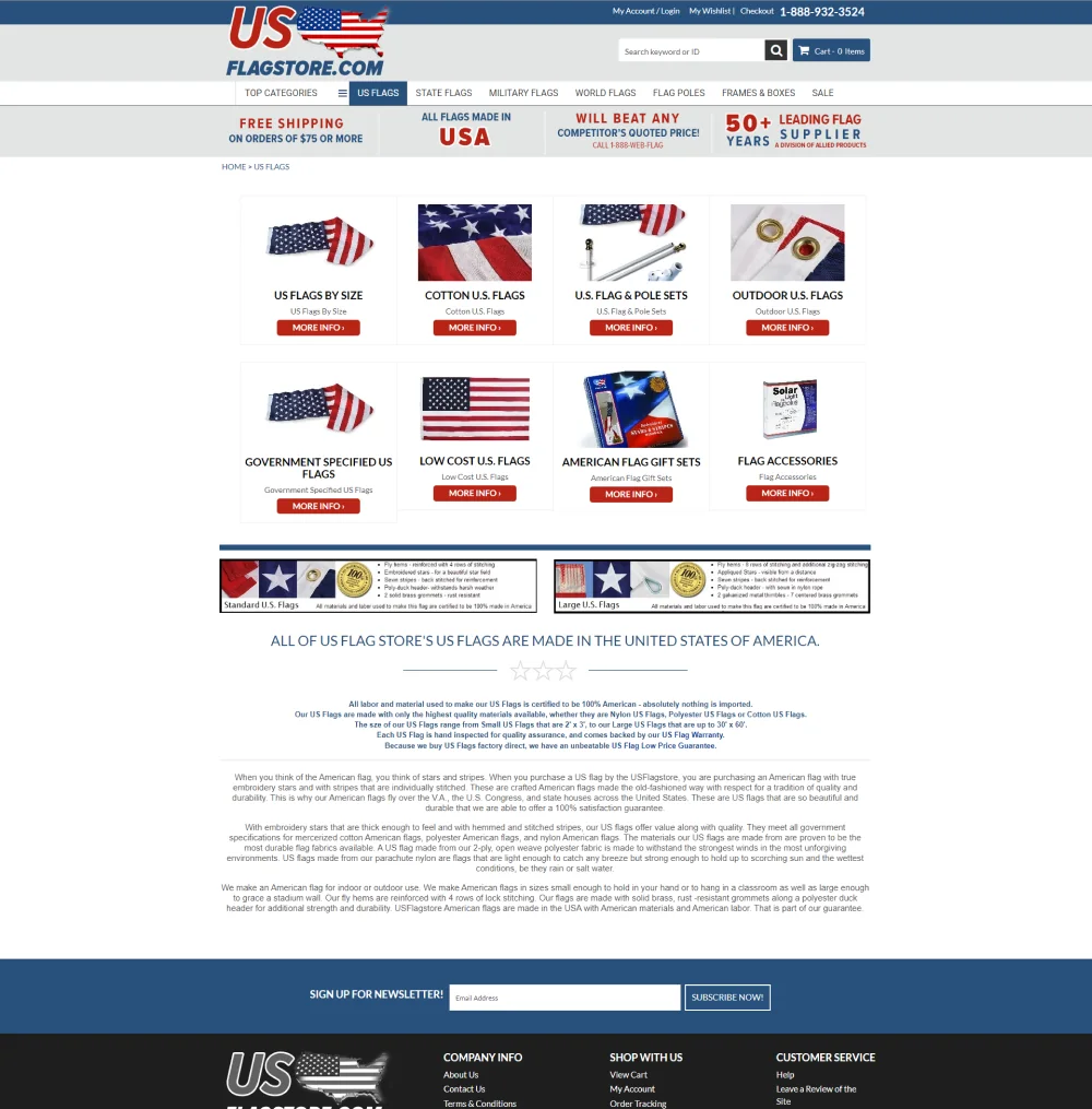
USFlagStore.com U.S. Flags category page on Volusion: eight subcategory tiles with More Info buttons (by size, cotton, flag and pole sets, outdoor, government specified, low cost, gift sets, accessories), two panels comparing standard and large U.S. flags, and the heading All of US Flag Store's US flags are made in the United States of America
The category page for U.S. flags.

Design · Category page

Category Pages That Explain the Choice

A flag category is a set of decisions: size, material, indoor or outdoor, with a pole or without. The category page shows each subcategory as a tile with a photo, a name, and a More Info button, eight to a screen for U.S. flags.

Under the tiles, two panels compare how standard and large flags are built, down to the rows of stitching on the fly hem and the grommets. Then comes a plain statement, "All of US Flag Store's US flags are made in the United States of America," with the detail behind it for shoppers and for search engines.

The four promises stay in place under the menu, so a shopper who lands on a category from a search result sees them without visiting the home page.

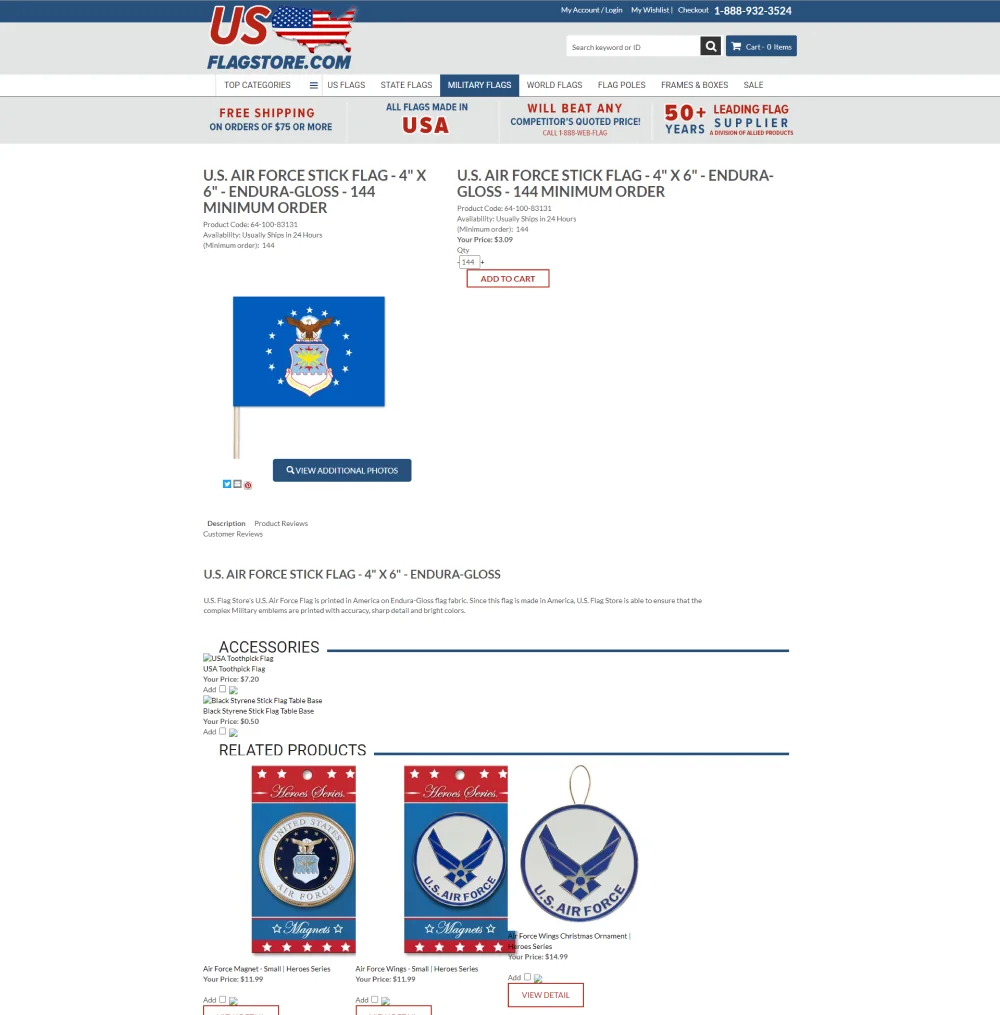
USFlagStore.com product page on Volusion for a U.S. Air Force stick flag: product code, availability, minimum order, price, quantity, and Add to Cart, a photo with a View Additional Photos button, description and review tabs, accessories, and related products
A product page.

Design · Product page

A Product Page With Nothing in the Way

The product page puts what a buyer needs at the top: the name, the product code, availability ("Usually ships in 24 hours"), the minimum order where there is one, the price, a quantity field, and Add to Cart.

The photo opens to additional views. Description and reviews sit in tabs beneath it. Accessories that go with the item, such as bases for stick flags, can be added with a checkbox, and related products follow.

Store-wide details like these are built once in the template and then apply to every product in the catalog.

Custom development

One Layout for Every Screen, on Volusion

In May 2016 we announced that USFlagStore.com had gone responsive. On a phone, the phone number moves to a bar across the top, the departments fold into a menu button, and the logo and the cart share the next line. The banner and the content stack beneath in a single column.

Volusion does not hand a developer the page markup to rewrite, so the layout was built in the store template with CSS and scripts that reshape what the platform produces. It is the core of our Volusion responsive design and Volusion development work.

One layout also means one set of pages to maintain and one address per page, which is the setup Google recommends for mobile.

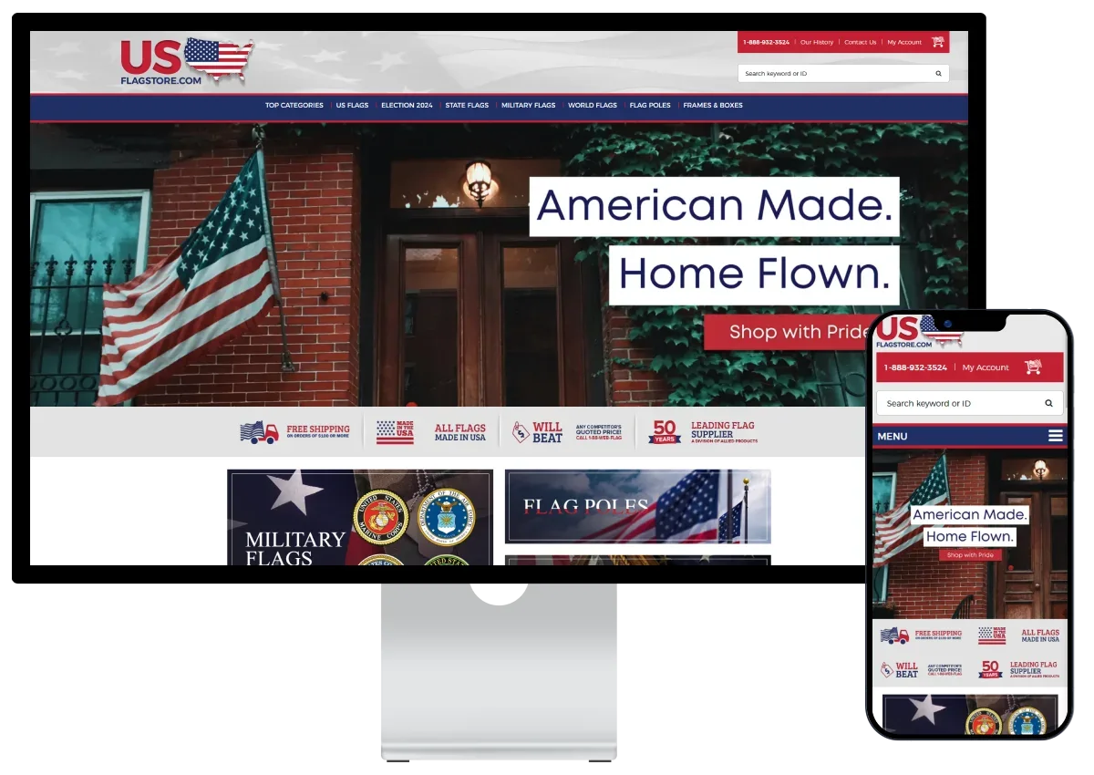
The later USFlagStore.com design on a desktop monitor and a phone: an American Made, Home Flown banner over the same department menu, the same row of promises, and tiles for military flags and flag poles
The later headless store, with the same menu, promises, and tiles.

Afterward

What Came Next: The Same Structure on a New Platform

The store has since moved on from Volusion. It was rebuilt with a headless front end on BigCommerce and given a new look, "American Made. Home Flown."

What the new store kept is the structure of this redesign. The menu still runs from U.S. flags to frames and boxes. The same four promises sit under the banner. The home page opens on the same category tiles. Product pages still use Volusion-style addresses, so links that point at them keep working.

The USFlagStore headless build has that story, and headless commerce explains the approach.

In detail

What the Redesign Included

Taken from the screens of the finished store.

Header and navigation

  • The phone number at the top of every page
  • Account, wishlist, and checkout links
  • Search by keyword or product ID
  • A cart button with the item count
  • A department menu with a Top Categories list
  • On phones: a menu button, the logo, and the cart

Home page

  • A banner slider for flags, promotions, and causes
  • Four promises in a row under the banner
  • Tiles for military flags, flagpoles, and display cases
  • Featured products
  • Banners for state and historical flags
  • The made in America story and a newsletter sign-up

Category and product pages

  • Subcategory tiles with More Info buttons
  • Panels comparing standard and large flags
  • Category copy written for shoppers and search
  • Product code, availability, and minimum order beside the price
  • Accessories added with a checkbox
  • Description and review tabs, and related products

The outcome

A Store That Says "American Made" on Every Screen

USFlagStore.com came out of the project with a store that states its case before a shopper has to ask: where the flags are made, what shipping costs, and what happens if a competitor quotes less. Three templates carry that message through the whole catalog, on a desktop and on a phone. The structure held up well enough to be carried onto the store's next platform.

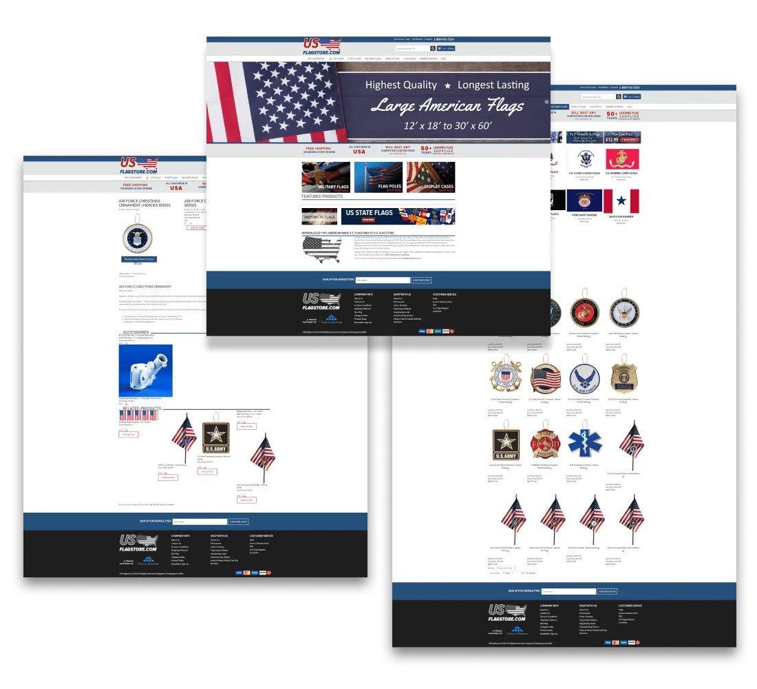
Three pages of the USFlagStore.com Volusion design overlapping: a product page for a Christmas ornament, the home page with its Large American Flags banner, and a military category page with rows of products
The product, home, and category pages of the redesign.
The redesign, template by template
TemplateWhat the shopper seesWhat it is there to do
HeaderPhone number, search by keyword or product ID, cart, department menuMake help and the catalog reachable from any page
Home pageA banner, four promises, three department tiles, featured productsAnswer "why buy here" on the first screen
Category pageSubcategory tiles, comparison panels, made in America copyHelp the shopper choose a kind of flag
Product pageCode, availability, minimum order, price, accessories, reviewsLet the buyer order without hunting for details
Phone layoutPhone number bar, menu button, logo, cart, one columnServe the same store to a small screen

What it shows

What Other Stores Can Take From This

The flags belong to one store. The decisions apply to most catalogs, on Volusion or anywhere else.

  • Plan before you design

    A roadmap through the content, the analytics, and the marketing tells you what the home page should lead with. Without it, a redesign is a new coat of paint.

  • Put the promise where the doubt is

    Shipping, origin, and price worries come up on every page. Four short promises under the banner answer them wherever a shopper lands.

  • Design templates, not pages

    Three templates sell every product in the store. Time spent on the category and product templates pays back across the whole catalog.

  • Build structure that outlasts the platform

    Departments, promises, and page addresses that work can move with you. See Volusion to BigCommerce migration.

Questions About This Volusion Redesign

What we did for USFlagStore.com and what it means for a store planning the same work.

What did MAK Digital do for USFlagStore.com?

We started with a digital roadmap covering the site's infrastructure, content, analytics, and marketing. Then we redesigned the Volusion store: a new header and menu, a home page built around four promises, new category and product page layouts, and a responsive layout for phones and tablets.

Can a Volusion store be fully redesigned?

Yes. Volusion produces the category and product pages itself, inside the store's template, so a redesign is done in the template with CSS and scripts. Within that, the header, the navigation, the home page, and the look and layout of category and product pages can all be changed. Our Volusion web design page shows the range.

Was the store made responsive?

Yes. We announced the responsive version in May 2016. One layout serves desktops, tablets, and phones: on a phone the departments fold into a menu button and the content stacks in a single column.

What is a digital roadmap?

The planning step before design. We review how the site is built, what content it has, what the analytics show, and what marketing is running or has run, and turn that into goals and priorities for the redesign.

What happened to the store after this redesign?

It was later rebuilt with a headless front end on BigCommerce and a newer design. The departments, the promises under the banner, and the Volusion-style product addresses carried over. The headless build case study covers that project.

Should I redesign my Volusion store or move to another platform?

It depends on what is holding the store back. If the catalog and the tools work and the storefront is the problem, a redesign is faster and costs less. If you need features Volusion does not offer, a move makes more sense. We do both: see Volusion development and Volusion to BigCommerce migration, or ask us which fits your store.

Is Your Volusion Store Showing Its Age? Start With a Plan.

Send us your store address. We will tell you what a redesign would change, what it would leave alone, and what it would cost.

See all Case Studies

More on Volusion Development

From the eCommerce Experts

Read Our Blog

Start Your Project With Us

Share some details, and our team will follow up.

Please write at least 20 characters.

Click to upload or drag and dropUp to 5 files, 10 MB each

    Get the MAK Digital Newsletter

    eCommerce design, development, SEO, and marketing insights, a few times a month. No spam, unsubscribe any time.

    By subscribing you agree to our privacy policy.