 1-888-553-8776
What to do, and not to do in building mobile forms.
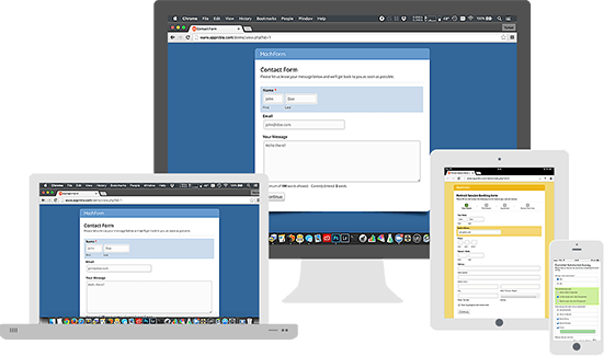
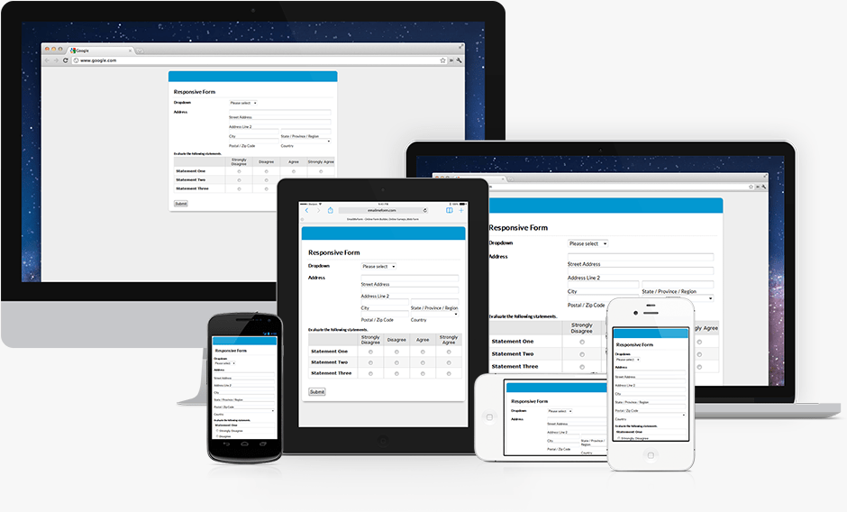
Online forms can be challenging to create, especially when considering responsive design and how your forms will break down on phones and tablets. When people view your site and are using their finger to select and navigate your forms, it’s vital that you design them with ease of navigation in mind.
The good news is that mobile forms are getting simpler and more convenient with one-time sign up and secure data storage, but UX designers still have to be vigilant when designing their forms to ensure it flows well and is easy to populate for someone using their finger on a small touch screen.
User experience is more than good images with working code. For a website or mobile application to have good UX, you need to create a path, or “flow”. A form is like a conversation in the user experience flow, so we have to build it as such. At any point, if the form is messy or unclear, it will irritate potential customers and deter them from completing the form, and in turn, leaving your website. A potential customer or email subscriber is needlessly lost because of sloppy UX.
So how do we create a good form? Intuitive paths. Make it easy for the user to navigate through and understand the goal of the form, give cues that lead the user to what is expected and when finished delivers the promised value, be it a confirmed shipping address for an E-commerce store or a E-mail newsletter for a company. I’m going to run through a list of 12 fundamental design principles we use at MAK Digital Design for our clients.

1:Grouping Similar Information Together
On your website, when your form is long with multiple input fields, try breaking it up in smaller chunks. This is important because grouping related information together will create logical flow between the sections. It will help the user process the input fields more fluidly through creating visual cues for them to follow.
2: Set the Numerical Keyboard by default
This tip is just obvious and common sense. If your input only requires numeric characters, set the numeric keyboard as default. Doing this ensures faster and easier filling process for the user, and in case you want to avoid special characters in the password section, disable them from the keyboard. There is really no simpler way to ensure it, however, it’s not as easy as it sounds.
3: Adjust the field length with the character limit
All input fields have set character length, yet some inputs require even smaller fields. For example, CVV codes or zip codes. Setting a smaller input field provides a visual cue to the user, while on the contrary, an absence of these can leave the user confused and irritated. Having shorter input field also save valuable space on the mobile screen.
4: Specify validation and errors
When you define validations for your input fields, you’d want to ensure that your descriptions are detailed, but at the same time succinct. Similarly, if you have an errors that occurs the user should have a clear understanding of what went wrong. Only then the user will be able to rectify it. Unclear and recurring errors can and will result in frustration with your users on your website or mobile application.

5: Define additional information and optional fields
Compulsory labels are often denoted by the * sign, which leaves the optional fields unmarked. Doing this practice is counter-intuitive. UX designers want to keep minimum fields possible. Therefore, only the most relevant ones make it to users. More often than not, forms have very few optional items, and for good reason. Thus, it only makes sense to label the optional field rather than using a * sign. Make things as clear as you can for potential customers on your website.
6:Highlight and Describe the CTA’s
CTA’s are the ultimate step in UX. It signals the completion of an action, or it leads to the next phase. Therefore, CTA’s need to be descriptive. Instead of using generic terms like “Submit / Cancel” or “Yes / No”, make an effort to use specific verbs such as “register” or “sign in” or “place order”. As an added benefit this specific names can help with SEO. Lastly, highlight them to create a sublime and obvious clue that will lead the user towards your desired path.
7:Design your checkbox and radio buttons with fingertips in mind
Though names and password are the most common fields in forms, there are plenty of situations that require checkboxes or radio buttons. Having horizontal list for radio buttons is not a hassle when it is on the web. This is because it is easy to move the cursor. However, when considering tablet and mobile design, you have to ensure that there is enough spacing between options on mobile for fingers to be able to click. This can make or break a form’s success rate, if you irritate your potential customers with a poorly made mobile form, they will leave!
8: Resist the impulse to use labels as input text
With the rise in minimalist design brought out the concept of using labels as input text. However, it does not last its original popularity, ESPECIALLY in mobile devices with a host of distractions that can lead to confusion when the input text disappears. The user is then left staring at a blank box.

9: Avoid using ALL CAPS
Writing in caps can be very jarring. Some people love it, some people hate it. It can make or break a call to action for people. Give great consideration when using it. It’s difficult to read for some people, so avoid using it unless you find it necessary or if you want to write abbreviations. Using basic grammar laws such as capitalizing the first alphabet. These are basic rules that customers are familiar with and will tend to follow effortlessly.
10: Use Spacing to serve as a visual clue
White space is the most subtle clue in User Interface(UI). Be it web, tablet, or mobile. Adjusting the space between two labels to be more, while at the same time keeping the space between the input field and its label would undoubtedly serve as a visual clue for potential customers filling out forms on your website.
11: Align your labels to the top
Usability research with the help of heat maps have supported the idea of lean form structure where your input labels are centered and aligned on top of the field. Doing this means that there is more space for your input fields for touch or tap actions, this is vital when considering how people browse web pages on phones and tablets using their finger instead of a more precise mouse on desktop computers.
12: Keep your forms in one column
So, since mobile screens are much smaller, there is no space for more than one field to appear clearly on the small view port size that phones have. Just in case that the web version of your website has two fields sitting next to each other, then it’s time to realign it! Keeping it as one column also ensures that users do not miss any fields. This is especially important to consider when design for smartphone and tablet view ports.