 1-888-553-8776
7 Tips To Make Your Site Mobile Friendly
Mobile Friendly Sites

Make sure your site is mobile friendly. Make sure your site is responsive. Make sure your mobile customers are being looked after. That’s old hat. Simply being “mobile friendly” isn’t enough these days.
With more customers suing their phones to make purchases, it’s time to put your mobile users’ needs first.
Mobile First!
But we put all all of our customer first, may be your first response. What exactly does this mean? How should your website, content and strategy adjust to make itself amenable within a mobile first framework?
To quote Elizabeth Barrett Browning (no, it’s not Shakespeare), “Let me count the ways.”
1. Speed Matters!

This is not something you haven’t hear of before. Speed matters! This is especially true when it involves any activity that is conducted online. When it comes to mobile, it matters exponentially much more. Google research reveals that “55% of mobile site visitors leave a page that takes longer than three seconds to load.”
However; according to the same research, “the average time it takes to fully load a mobile landing page is 22 seconds.”
In life, we have obstacles, which we can view as challenges or opportunites. In this matter, if you speed up your site enough so that it can load in 3 seconds or less for mobile users, you will be the envy of the competition.
This will result in more traffic, leads and sales.
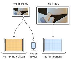
2. Be certain your site is “Responsive”

Look at your site. Make sure it is “responsive”, as we call it in the “tech world.” We call a site “responsive” when it responds to whatever device it is read on. Remember when a site would go goofy before “responsive” was pretty much the norm.
Most new WordPress themes and DIY site platforms like WIX are built to be responsive. However; even if your IT person says “of course your is responsive”, don’t simply just take their word for it. Physically check your site on your own mobile devices. Your tablet and your cell should be checked so you can see for yourself!
Be sure to check each page, submit every form and every platform. Check out your social media, be sure to place an order. Even write a review. Make sure you test everything on your site.
This way you can make sure that the function can be done on a mobile device and that it is as easy a possible to do on a mobile device.
And when you think that you have gotten this thing mastered, have a teenager or millennial (or even an 8 year old) go to do all that stuff over again.
Make sure you get detailed and candid feedback about what they think about your site’s usability. Young people are often more savvy and more judgmental. They are very direct and frank about what they consider to be good or bad about a site. They take this approach with just about everything in their young lives.
3. Create A Space Where Key Information on your site is Easy For Mobile Users To Access

Even if you have a fast, mobile-friendly website and you think you can rest on your laurels. That isn’t enough. Your site also has to give mobile users what they want, and fast.
So what else do they want? They also want directions, how much the items cost and locations that are near them.
This information is included on smart business people’s sites, unfortunately, not on all sites. According to the WASP Barcode State of Small Business Report in 2017, it was revealed that only 55% of businesses have the company location and phone number. Many less businesses had directions to their location or pricing information.
4. Use a website design that offers tabbed content

WordPress has a free plugin. It is “Tabby Responsive Tabs” which can make it very easy to set up. Free is a good thing? Right?
5. Format your content for scan and small screen
Good SEO important. Let’s examine best practices, especially for text:
Keep paragraphs short
No more than five lines of text
Use plenty of whitespace
Use a highly-legible typeface
Break up text with images (for each 300-400 words)
Use subheaders
Use a highly-legible typeface
Use a font size of at least 12 points
6. Vary your content formats
Mobile visitors will read, but many of them would welcome other content formats. Namely, video. Or even an interactive tools. Or an infographic or clickable slideshare of slideshow.
You do not have to make everything you publish into a video. But you can “80/20” it. That is you pick your 20% most visited or most profitable text-based content. Then turn that into a video. You can turn it into an interactive tool or whatever you may think will work best.
This will ensure you will keep mobile users on your site longer. This in turn, is likely to get you more leads and increase sales also.
7. Summarize! Keep is simple stupid.

You have to have heard of that acronym, KISS. It stands for “keep it simple stupid”. This is especially true with mobile users. Mobile users tend to be more distracted. Because of this, it is better to use shorter more “snackable” content. This is what often works for them.
Brevity
Remember, the “shorter is better” rule is not always applicable. There are many mobile users on website who are currently reading 10,000 word articles written at a graduate school level.
However; the point still holds: mobile readers usually appreciate brevity.
Be sure to offer brevity, however; you can still offer the long form content Google loves. Simply summarize it.
Summarize!
Summaries can appear as a first paragraph or even as a last paragraph. If you notice on sites like Search Engine Land, summaries are often given the subheader “TL,;DR:, as in “too long; didn’t ready.” Ouch!
Another way to distill your content for mobile users is to optimize it for instant answers. This refers to the blocks of content that sometimes appear at the top of the search results. They usually answer a specific question someone has searched.
This Sounds Like A Lot Of Work
While it may be tempting to dismiss some of these tips as “too hard”, just consider that there is more traffic from mobile devices than from desktops.
So even if you are a local business, the traffic is even more skewed to mobile users because more mobile searches are location based.
Conversely, optimizing content for mobile devices is a bit more work. But it is how most people use the internet now. And even more people will use it this way in the future. So it will be foolish to ignore that mobile traffic and those users and it will hurt your business.
Worth The Work!
There isn’t a way to quantify how badly it will affect your business, but it definitely will be affected. So if optimizing your content got you just 10% more engagement with your content, and the associated increase in sales, don’t you think it would be worth it?
The increase in sales would pay for the optimization. It may be worth your time.
In closing, if you are optimizing your content for mobile users, you know what has worked best for you and you are already ahead of the game. Keep up the good work!