 1-888-553-8776
How to Make WordPress Images Responsive

WordPress is very powerful, its why people love it. Its free, opensource, and has a huge community supporting it. Making a responsive theme and integrating it is pretty easy once you know the basics of theming. Responsive images, on the other hand, are not something WordPress deals with by default. You can either manually resize each image, then in the HTML editor you could manually type the image tag, srcset attributes and each image. This will not only take time, but could be an issue for any webmasters that aren’t HTML-literate. Thankfully, there is a way to make WordPress do all the heavy lifting. With the help of a plugin, it can generate all the image sizes from a single image upload and implement the image tag and srcset attributes anywhere the author choose to insert the image.

Every time you upload an image WordPress saves it at its native size. It also automatically generates 3 resized copies in these standard sizes (either height or width may change based on image ratio):
Thumbnail (150×150)
Medium (300×300)
Large (1024×1024)
This is a really powerful feature as it can be customized to make any image size. This means you do not need to make multiple copies of an image in different sizes. You just upload a single image, and WordPress creates the resized copies.
This is done by modifying the functions.php file. To add new image sizes, you need to add calls to the add_image_size function. Here’s an example that adds four new image sizes:
add_image_size( ‘sml_size’, 300 );
add_image_size( ‘mid_size’, 600 );
add_image_size( ‘lrg_size’, 1200 );
add_image_size( ‘sup_size’, 2400 );
Each call to the function includes a name (so WordPress can identify the size) and a width. The new sizes will be 300, 600, 1200 & 2400 pixels wide. It is possible with the add_image_size function to have WordPress also set the height or crop the image, but the example above will keep the original image aspect ratio.
(More can be found out about the add_image_size function in the WordPress Codex.)
The example above only shows four new image sizes being added, but you may want to add more or less… this will be based on your theme design. Now any time an image is upload to WordPress, it will generate the new image sizes. The next step is to include them in the HTML.

In order for WordPress to output all the image sizes, a new plugin needs to be installed: the RICG Responsive Images plugin. Once it is installed and activated all the images sizes will be included in the image tag via the srcset attribute.
Typically when an image is added to a page in WordPress the output HTML looks like this:
There is a single image in the src attribute.
Once the plugin is installed the HTML will look like this:
All the new image sizes have been added via the srcset attribute.
The plugin also includes Picturefill.js, a responsive image polyfill which adds support for both the picture element and the new responsive attributes for the img element. This, together with the srcset attributes now being included in the image tag is what makes your images responsive.
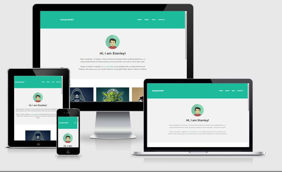
YOUR IMAGES ARE NOW RESPONSIVE
Now the images on your website will be responsive — the browser will choose the most appropriate image to download.
Users on devices with smaller screens will get the smaller images. Your website will load faster as these images will download quicker, they will need less of the users’ bandwidth. Users on devices with larger screens will get the bigger images. They won’t appear pixelated or of a lesser quality.
There is only one potential problem with this method: it will only work with images uploaded to WordPress after the RICG Responsive Images plugin has been installed. If it is a brand new website you are working on then this may not be a problem,
however if it is an existing website with existing content the new image sizes which you added in functions.php won’t have been generated. Thankfully, you don’t need to re-add all the images — there is a plugin which can help.
The Regenerate Thumbnails plugin will go through all the existing image attachments and re-generate the new image sizes based on the new ones created in functions.php – it is a real time saver and only requires the click of a single button.
Once installed, go to Tools -> Regen. Thumbnails then click the “Regenerate All Thumbnails” button. A status bar will appear and you will see the information about how many images have been resized.
Now, all the existing images in your website will be output correctly using the image tag via the srcset attribute.