 1-888-553-8776
BeFit Supplements New Product Page
We have an exciting store make-over launching today! We were very interested when BeFit Supplements asked us how they can change their ordinary product page into a “wow” new product page. Let’s take a look at some of the changes we did.
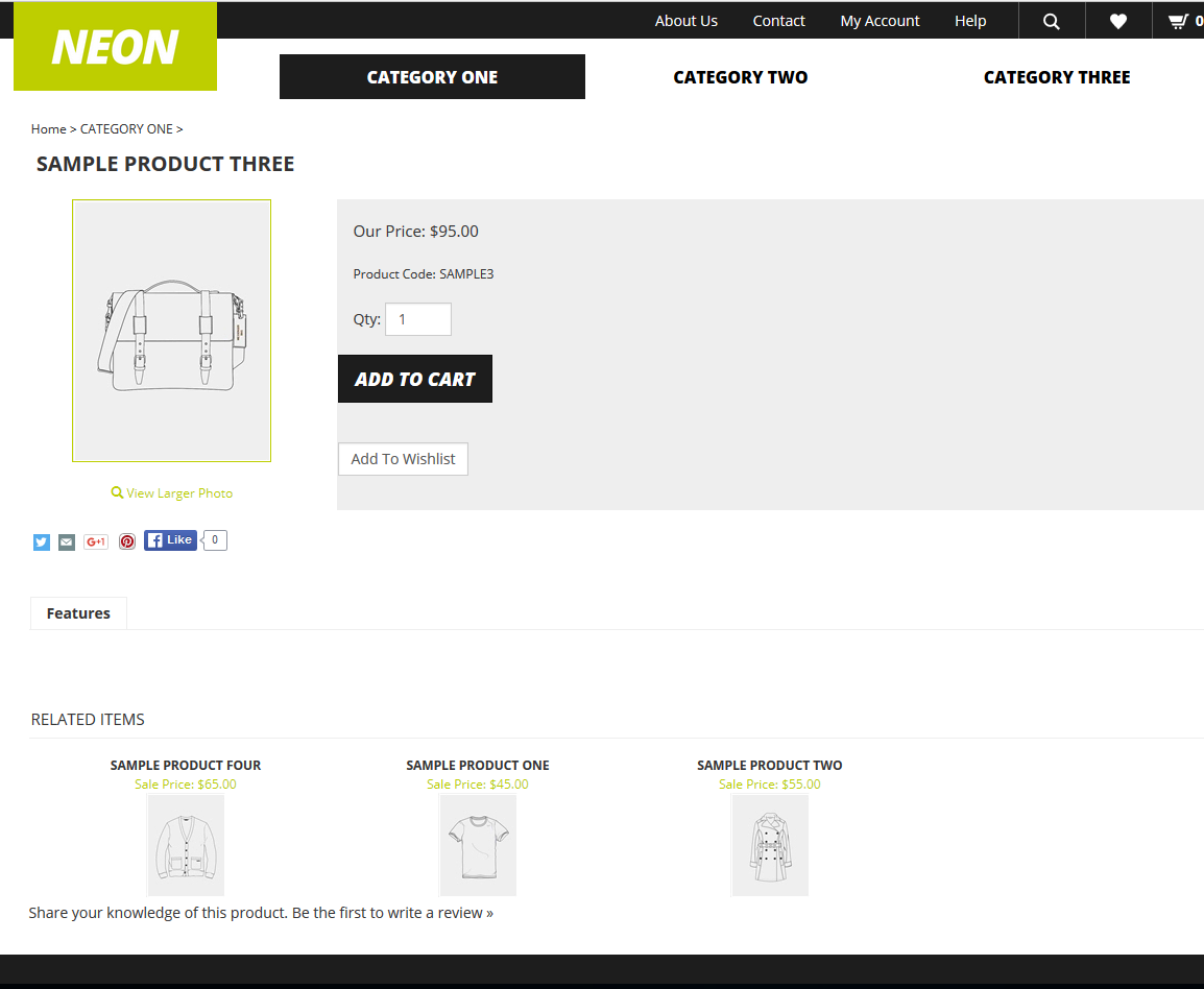
Originally the product page looks something like this:
After seeing this page, the company BeFit Supplements contacted MakDigitalDesign requesting some improvements. We gladly accepted the offer. The company had some suggestions on what they wanted to tweak. We took these suggestions and made it happen! Here’s what the new product page looks like:
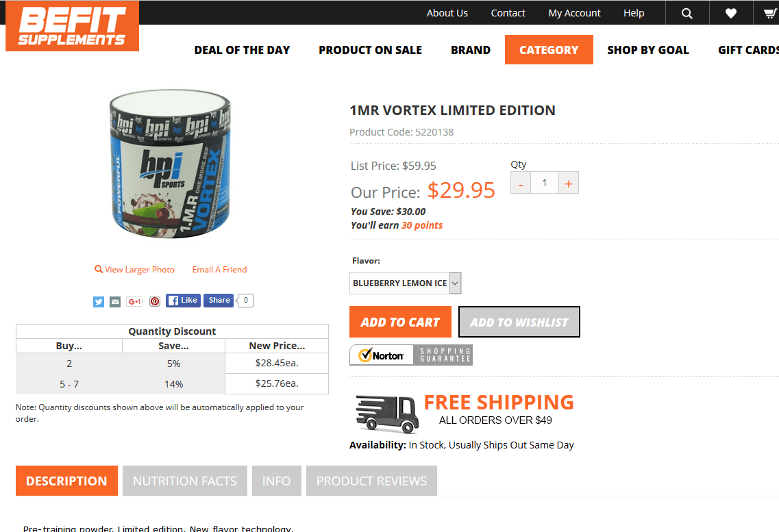
Some major changes were size of font and position of buttons. We moved up and enlarged their ‘Add to Wishlist’ button allowing customers to easily access both, while being eye-appealing. The price and product name size were too small so we made it pop with a larger font and color. We put a background on the tabs for description and nutritional facts, along with adding another tab for Product Rating. This allows the customers to write a review, giving more security to new buyers. We demolished the frame around the product photo and added a quantity discount chart underneath. This encourages shoppers to buy more and save more. We also enlarged and made a friendly logo for the “free shipping” text.
This new layout is much more pleasing to the eye and appealing to buying customers. This company now looks like a brand you can trust with a legitimate website. There are other functionalities we are able to add, so don’t hesitate to call or comment below!
It was a pleasure working with BeFit Supplements and we look forward to any business with them in the future.